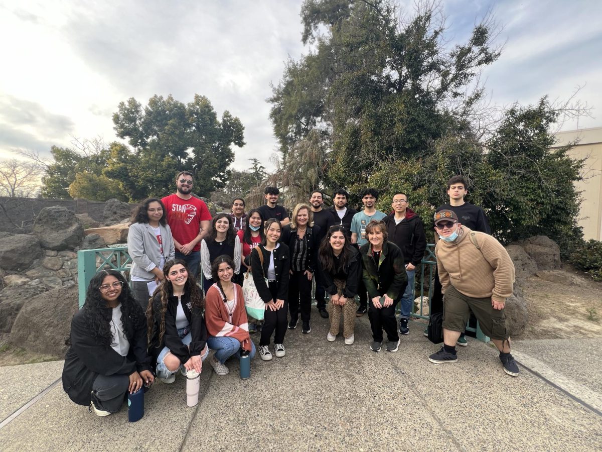
The Signal advisor, Signal graphic design team, print shop members and graphic design professionals held a meeting in the Signal’s office last Friday to discuss an upcoming newspaper redesign.
Time, National Geographic, Money and other magazines were sprawled across the computer lab floor as the graphic design team scurried to make final changes to the material that would be presented as options for the new design.
As the graphic designers worked diligently, the guests began to gather in the office.
One of the guests was Brad Peatross, a graphic specialist for California State University, Stanislaus’, (Stan State), School of the Arts.
Peatross, who has 30 years of graphic design experience, anticipates the redesign will be beneficial for the Signal.
“It’s really improving your publication and should improve readership by having it be a more appealing publication, looking modern and looking like it reflects the current trends and students,” said Peatross.
Peatross also expressed his appreciation for getting to be a part of the redesign process and extended the opportunity for The Signal to work with him in the future.
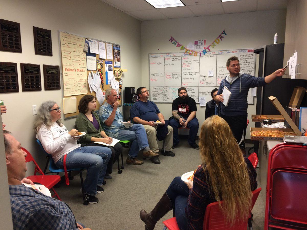
When The Signal’s Advisor, Dr. Stevens made her way through the door with pizza, the meeting promptly began.
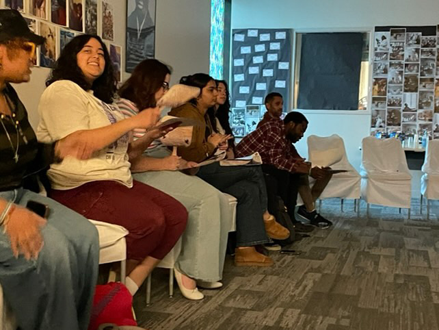
Sitting in a circle, and with slices of pizza on their plates, the team began their meeting.
The discussions ranged from topics as major as changing the paper’s brand identity, to minute details such as font styles.
In addition to the graphic designers discussion of rebranding, cover art, and layout of spreads, print shop members discussed the different types of paper options.
The idea of dropping “the” from The Signal’s logo prompted Dr. Stevens to go into the morgue, a room where past issues reside, to check whether historically “the” has always been a part of the paper’s name.
An issue from 1963 emerged from the archives that featured a Native American as the paper’s mascot.
The racially insensitive logo gave a look into one of many past designs that The Signal had undergone in the past, and it strengthened that dropping “the” in the logo was a valid option.
Overall, the meeting was productive as it left the graphic designers with new information that could be utilized in designing what is to come.
The Signal’s lead graphic designer, Madison Toel (senior, Fine Arts Major), will be graduating this semester, and hopes that the new design will be a strong foundation for future Signal members.
“I’m excited, and I will hopefully leave everyone here with good, solid groundwork to continue on with,” Toel said.
Although the team is currently developing and implementing some of the suggestions that were made by the professionals, Graphic Designer Simarjit Kaur (junior, Computer Science) expressed her excitement about the new possibilities the redesign has presented.
“I’m excited to see what it will look like. I like that we are going towards the magazine [style], it will be fun to do the cover for graphic designers and photographers who take a really great photo,” said Kaur.
The changes are expected to be put into effect for the December 2017 print publication of The Signal.
